

Product tabs
The Product tabs section allows you to create multiple tabs, each with a corresponding collection, providing a dynamic way to display content.
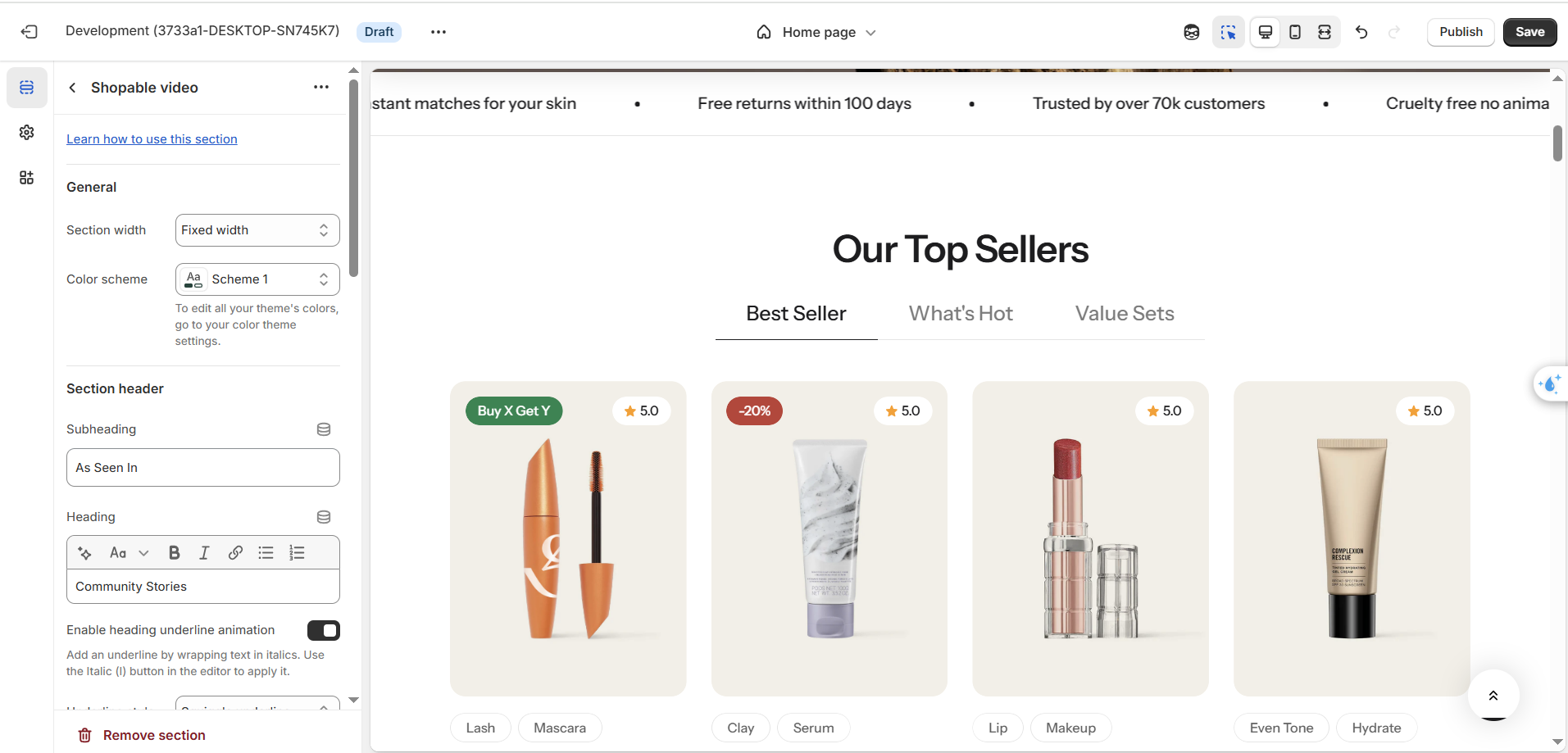
Section settings
General settings
| Setting | Description |
|---|---|
| Color scheme | Select colors from Theme settings -> Colors |
| Subheading | Subheading content |
| Heading | The title of the section |
| Enable heading underline animation | Enable heading underline animation |
| Underline style | Select Underline style |
| Underline color | Customize Underline color |
| Description | The description of the section |
| Heading size | The size of the title: |
| Alignment | The position of the heading and description. |
Carousel settings
| Setting | Description |
|---|---|
| Maximum items to show | Limit the display of the number of posts. Minimum: 2. Maximum: 12. |
| Items per row on desktop | Number of columns to display on desktop. |
| Column gap | 4 options for column gap |
| Show navigation | Display the next and back controls for the carousel |
| Show pagination | Display the pagination for the carousel |
| Reveal next slide | Display a part of the upcoming slide. |
Mobile options
| Setting | Description |
|---|---|
| Items per row on mobile | Number of columns to display on mobile devices. |
Block setting
| Setting | Description |
|---|---|
| Show view all button | Show view all button |
| Hide tab description on mobile | The description on every tab will be hidden on mobile devices |
Section padding
| Setting | Description |
|---|---|
| Top | Customize the top margin of the section |
| Bottom | Customize the bottom margin of the section |
Block settings
| Setting | Description |
|---|---|
| Collection | Select the collection you want to display |
| Title | Title of each tab |
| Description | Description of each tab |
Product tabs with banner
A Product tabs section can show a banner next to its product list. Each tab has its own banner, so the banner changes when the shopper switches tabs.
The banner works only with the Horizontal desktop layout. The Vertical layout has no banner settings.
Add the banner
You can use the preset Product tabs with banner, or add it yourself:
- Add a Product tabs section.
- Set Desktop layout to Horizontal.
- Turn on Show banner.
Banner section settings
These appear when the layout is Horizontal and Show banner is on.
| Setting | Description |
|---|---|
| Show banner | Show a banner next to the product list. |
| Banner position | Place the banner on the Left or the Right. Default: Left. |
| Banner width | Width of the banner, from 40% to 60%. Default: 50%. |
| Banner ratio | Shape of the banner image: |
| Sticky banner | Keeps the banner in view while the shopper scrolls the products. Desktop only. Default: on. |
| Show banner on mobile | Show the banner on mobile devices. Default: on. |
Banner block settings
Each tab has its own banner. These appear when the layout is Horizontal and Show banner is on.
| Setting | Description |
|---|---|
| Banner image | Image for this tab's banner. If you leave it empty, the section shows a placeholder. |
| Color scheme | Select colors from Theme settings -> Colors. |
| Vertical alignment | Position of the content on the banner: |
| Content alignment | Horizontal alignment of the content: |
| Subheading | Small text above the heading. Default: "Subheading". |
| Heading | Title of the banner. Default: "Talk about your brand". |
| Description | Text below the heading. |
| Button label | Text on the button. Default: "Button label". |
| Button link | URL the button opens. |
| Button type | Style of the button: |
Preset values
The Product tabs with banner preset starts with three tabs and these settings: banner on the left, 49% width, Square ratio, sticky banner on, banner on mobile on, carousel off, six items to show, and two items per row.
Mobile
On mobile, the product layout always displays as a carousel.
No comments yet