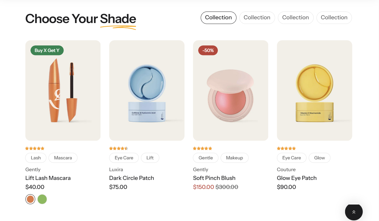
This section includes three preset styles to help customers easily find suitable products: Product finder: Color dots, Product finder: Pill tabs, and Product finder: Range slider. Each preset offers a different filtering experience based on product attributes, improving product discovery and user interaction.
Product finder: Color dots
Product finder: Pill tabs
Product finder: Range slider
Section settings
General settings
Setting
Description
Section width
3 options for container
Stretch width: span the section width regardless of screen size.
Fixed width: depends on your page content width in Theme settings->Layout.
Expand full width: takes up the entire space on the page and it usually resizes itself to fit the size of the screen.
Color scheme
Select colors from Theme settings -> Colors
Subheading
The subheading of the section
Heading
The title of the section
Enable heading underline animation
Enable heading underline animation
Underline style
Select Underline style
Underline color
Customize Underline color
Description
The description of the section
Heading size
The size of the title:
Heading 1
Heading 2
Heading 3
Alignment
The position of the heading and description.
Left
Center
Right
Show view all button
Enable or disable the "View all" button. When enabled, it allows customers to quickly navigate to the full product collection.
Collection tab
Setting
Description
Collection tab style
2 option:
Range slider
Pill tabs
Inline with heading
Show the color picker on the same line as the heading for a more compact layout.
Show color dot
Display a small color dot to visually represent each color option.
Carousel settings
Setting
Description
Maximum items to show
Limit the display of the number of posts.
Items per row on desktop
Number of columns to display on desktop computers.
Column gap
4 options for column gap
No gap
Small
Medium
Large
Show navigation
Display the next and back controls for the carousel
Show pagination
Display the pagination for the carousel
Reveal next slide
Display a part of the upcoming slide.
Mobile settings
Setting
Description
Hide description on mobile
Enable or disable the visibility of the description on mobile devices. When enabled, the description will be hidden on smaller screens.
Items per row on mobile
Number of columns to display on mobile devices.
Section padding
Setting
Description
Top
Customize the top margin of the section
Bottom
Customize the bottom margin of the section
Section divider
Setting
Description
Show divider
Display a dividing line to separate from the previous section.
Block setting (Product finder: Color dots)
Setting
Description
Collection
Select a collection to show
Image
Use an image as the current collection's thumbnail (147px x 72px recommended)
Color
Set the color of the dot. This setting controls the visual appearance of the dot indicator.
Title
Set a new title for your collection or leave it blank to use the collection's title
Block setting (Product finder: Pill tabs)
Setting
Description
Collection
Select a collection to show
Title
Set a new title for your collection or leave it blank to use the collection's title
Block setting (Product finder: Range slider)
Setting
Description
Collection
Select a collection to show
Image
Use an image as the current collection's thumbnail (147px x 72px recommended)
Title
Set a new title for your collection or leave it blank to use the collection's title


.png)
.png)
No comments yet