

Image cards
Image cards are designed to visually highlight categories, promotions, features, or links to internal pages. Each card functions as a navigational or promotional element and is fully responsive, adapting to different screen sizes.
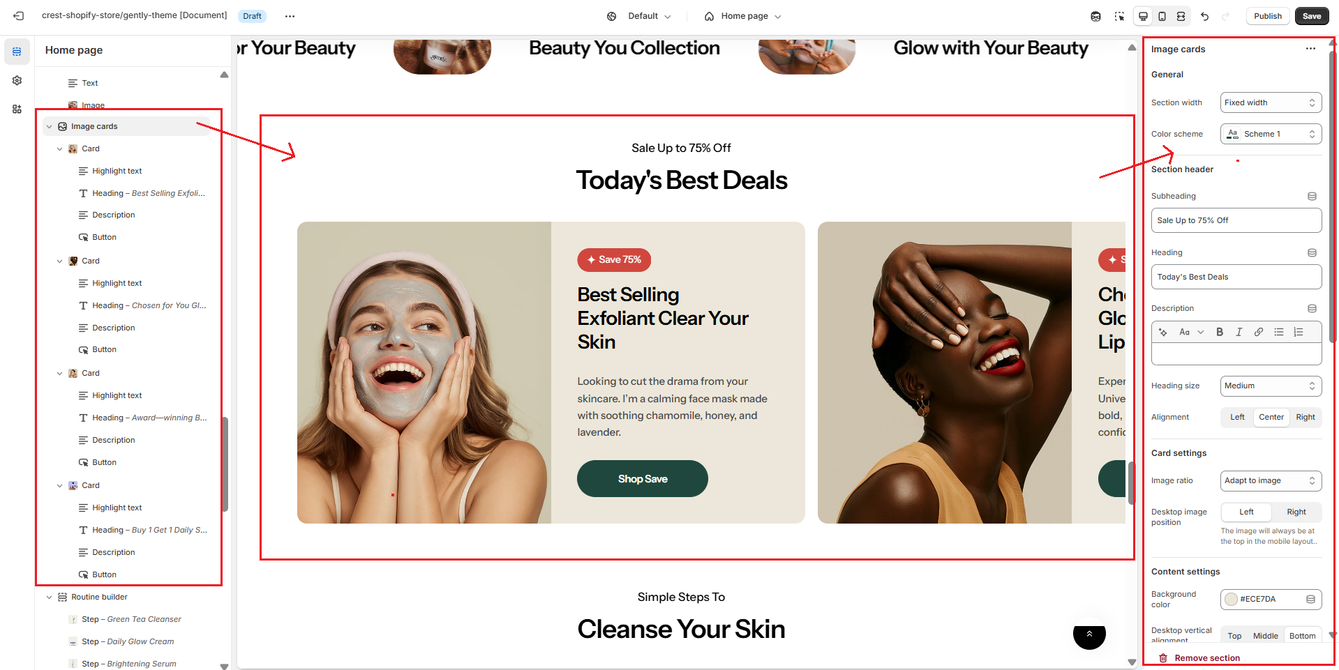
Section settings
General settings
.png)
| Setting | Description |
|---|---|
| Section width | 3 options for container
|
| Color scheme | Select colors from Theme settings -> Colors |
Section header settings
.png)
| Setting | Description |
|---|---|
| Subheading | The subheading of the section |
| Heading | The title of the section |
| Enable heading underline animation | Turn on an animated underline effect for headings. Switch off to keep a static look. |
| Underline style | Choose the underline's look. Include:
* Note: Only appears when Enable heading underline animation is enabled |
| Underline color | Pick the color used for the underline. * Note: Only appears when Enable heading underline animation is enabled |
| Description | The description of the section |
| Heading size | The size of the title:
|
| Alignment | The position of the heading and description.
|
Card settings
.png)
| Setting | Description |
|---|---|
| Image ratio | The image ratio for the featured images of the blog posts:
|
| Desktop image position | 3 options for desktop image position
* Note: Image will be shown above text on mobile. |
Content settings
.png)
| Setting | Description |
|---|---|
| Background color | Setting the background color of the content block |
| Desktop vertical alignment | 3 options for the desktop content position
|
| Content alignment | 3 options for the content alignment
|
| Gap | 4 options for column gap
|
| Padding inline | Adjust the horizontal spacing (left and right) inside the section. This value is automatically optimized for mobile devices. |
| Padding block | Adjust the vertical spacing (top and bottom) inside the section. This value is automatically optimized for mobile devices. |
Carousel settings
.png)
| Setting | Description |
|---|---|
| Items per row on desktop | Number of columns to display on desktop |
| Column gap | 4 options for column gap
|
| Show navigation | Display the next and back controls for the carousel * Note: Pagination will automatically show on mobile if you display the number of items on mobile as 1 or 2 |
| Show pagination | Display the pagination for the carousel |
| Auto-change slide | Enable or disable automatic slide transition. |
| Change slides every | Set the time interval (in seconds) between automatic slide transitions. |
| Reveal next slide | Display a part of the upcoming slide. |
Mobile options
.png)
| Setting | Description |
|---|---|
| Items per row on mobile | Number of columns to display on mobile devices |
| Content alignment | 3 options for the content alignment
|
Section padding
.png)
| Setting | Description |
|---|---|
| Top | Customize the top margin of the section |
| Bottom | Customize the bottom margin of the section |
Section divider
.png)
| Setting | Description |
|---|---|
| Show divider | Toggles the visibility of a horizontal divider line within the section. |
No comments yet